Stat views
With Adomin, you can also easily show graphs, pie charts and other KPI visualizations.
For this, you will need to write some backend configuration, and then the adomin frontend will render your charts with Chartkick, a js chart lib that uses chart.js under the hood.
Types of charts available
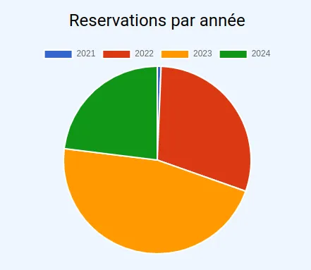
Pie chart
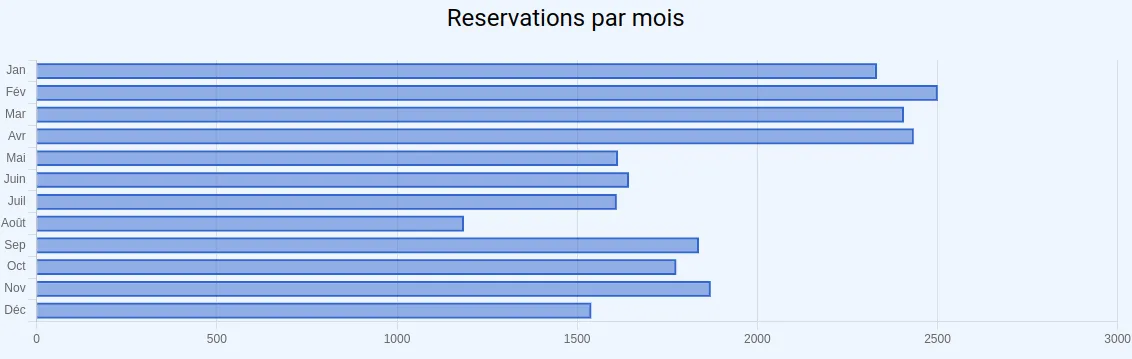
Bar chart
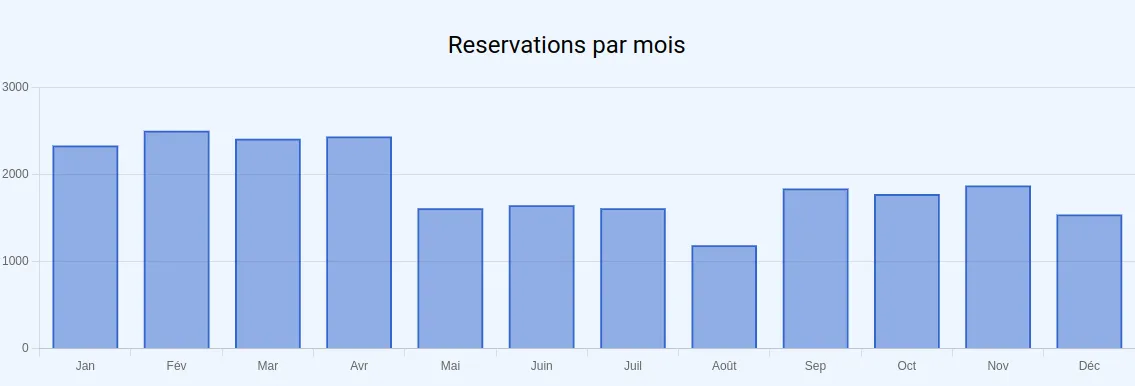
Column chart
Line chart
Area chart
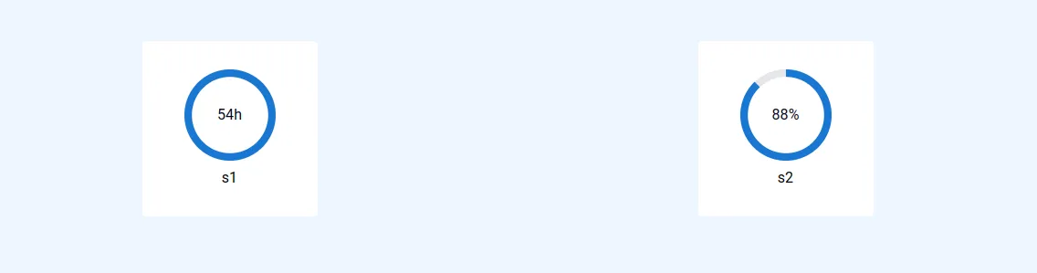
Kpi chart
Config
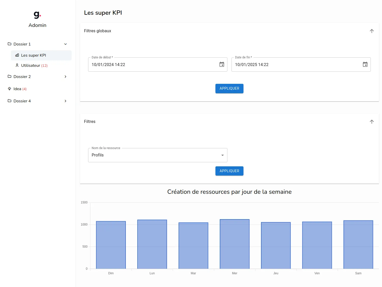
To declare a stat view page, you will need to add a StatViewConfig object inside the views array of the app/adomin/config/adomin_config.ts file.
export const ADOMIN_CONFIG: AdominConfig = { title: "Adomin", views: [MY_STAT_VIEW_CONFIG],};Use the createStatsViewConfig function to create your StatViewConfig object:
export const MY_STAT_VIEW_CONFIG = createStatsViewConfig({ path: "kpis", label: "Some stats", stats: [ { type: "column", label: "Users creation per day of week", name: "uniqueName", dataFetcher: () => groupByDayOfWeek("users", "created_at"), }, ],});The createStatsViewConfig allows you to pass an object with the stat view configuration.
You can pass the following options inside the config object:
name
Path in the frontend
label
Title of the view, displayed in the sidebar
visibilityCheck
Access check function to verify if logged in user can see this stat view
isHidden
Use this if you want to hide this model on the frontend. Frontend routes for create/update/list will still be created and available, but the navbar won’t show it.
icon
Icon name, by default this uses Tabler icons You can browse the list of available icons at: https://tabler.io/icons
globalFilters
You can add a global filter configuration to your stat view, this will add a filter form on top of the page.
The form filter data will be passed to all the dataFetcher functions of the stat view page as an object, so you can use it to filter the data you want to display.
See also AdominStat filters and filters example
stats
An array of AdominStat objects, each AdominStat represent a chart
AdominStat config
The AdominStat object has the following properties
type
Type of the chart to display, can be one of:
- pie
- bar
- column
- line
- area
- kpi
label
Label of the stat, displayed in the frontend
name
Name of the stat must be unique on the page, it is not shown to the user but used in things like react key prop
filters
You can add filters for this AdominStat graph or kpi, this will add a filter form just above the chart.
The form filter data will be passed to the dataFetcher function as an object, so you can use it to filter the data you want to display.
See also AdominStat config and filters example
dataFetcher
Function to fetch the data to displayed in the chart, must return a Promise<ChartRowData>
type ChartDataRow = [string, number];
type ChartMultipleSeriesDataRow = {  name: string;  data: ChartDataRow[];  color?: string;};
type ChartRowData = ChartMultipleSeriesDataRow[] | ChartDataRow[];
In practice it will look like this:
- data of the column chart example
const data = [ ["Jan", 2332], ["Fév", 2501], ["Mar", 2407], ["Avr", 2434], ["Mai", 1613], ["Juin", 1644], ["Juil", 1610], ["Août", 1186], ["Sep", 1838], ["Oct", 1775], ["Nov", 1871], ["Déc", 1539],];- data of the line chart example
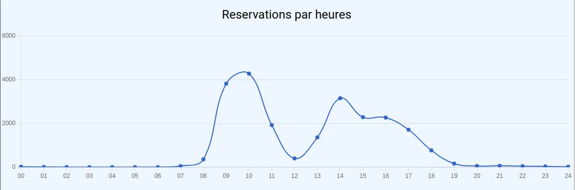
const data = [ ["00", 22], ["01", 9], ["02", 3], ["03", 1], ["04", 1], ["05", 0], ["06", 1], ["07", 49], ["08", 359], ["09", 3812], ["10", 4273], ["11", 1923], ["12", 400], ["13", 1361], ["14", 3148], ["15", 2282], ["16", 2265], ["17", 1711], ["18", 770], ["19", 164], ["20", 53], ["21", 63], ["22", 46], ["23", 34], ["24", 22],];options
When stat type is pie, bar, column, line or area you can pass the following options inside the config object:
interface ChartKickOptions { /** Title of x axis */ xtitle?: string; /** Title of y axis */ ytitle?: string; /** Width of the chart */ width?: string | number; /** Height of the chart */ height?: string | number; /** Show a download button, if this is a string, specify the name of downloaded file */ download?: boolean | string; /** * Adds a suffix to your data * * e.g. for the data [["Z", 4]] and suffix "%", the chart will display "4%" */ suffix?: string; /** * Adds a prefix to your data * * e.g. for the data [["Z", 4]] and prefix "$", the chart will display "$4" */ prefix?: string; /** Discrete axis for line and column charts */ discrete?: boolean; /** Only for type 'pie' */ donut?: boolean; /** Straight lines between points instead of a curve */ curve?: boolean; /** Colors array in hexadecimal or CSS Color keywords */ colors?: string[]; /** Minimum value (for y axis in most charts) */ min?: number; /** Maximum value (for y axis in most charts) */ max?: number; /** Stacked column / bar charts (usefull with multiple series) */ stacked?: boolean; /** Set a thousands separator * * e.g. for the data [["Z", 4000]] and thousands="," the chart will display "4,000" */ thousands?: string; /** Set a decimal separator * * e.g. for the data [["Z", 4.5]] and decimal="," the chart will display "4,5" */ decimal?: string; /** Set significant digits */ precision?: number; /** Set rounding */ round?: number; /** Show insignificant zeros, useful for currency */ zeros?: boolean; /** Specify the message when data is empty */ empty?: string;}When stat type is kpi you can pass the following options inside the config object:
export interface KpiStatOptions { /** * If true, the value should be a number between 0-100 and will be displayed as a percentage * @default false */ isPercentage?: boolean /** * Color of the mui CircularProgress */ color?: string}Data fetcher helpers
For basic charts, you can use these functions in your dataFetcher function:
- groupByDayOfWeek
- groupByDate
- groupByYear
- groupByMonth
- groupByHour
The signature of these functions is
type HelperFunction = (table: string, column: string) => Promise<ChartRowData>;only groupByHour differs slightly with an optionnal 3rd parameter:
type HourFunction = (  /** the sql table name */  table: string,  /** the sql column name */  column: string,  options: GroupByHourOptions = {}): Promise<ChartRowData>
interface GroupByHourOptions {  /**   * If true display all the range of hours (00 -> 24) instead of just the hours defined in the data   * @default false   */  allHours?: boolean}
In practice, you can use the data fetcher helper like this:
{ type: 'column', label: "Users creation per day of week", name: 'testColumnChart2', dataFetcher: () => groupByDayOfWeek('users', 'created_at'),}With multiple data series:
{  type: 'line',  label: "Users creation vs ideas creation per hour",  name: 'users-vs-ideas-by-hour',  options: {    download: true,    xtitle: 'Hour of day',    ytitle: 'Quantity',  },  dataFetcher: async () => {    const users = await groupByHour('users', 'created_at', { allHours: true })    const ideas = await groupByHour('ideas', 'created_at', { allHours: true })
    return [      {        name: 'Users',        data: users,        color: '#fff000',      },      {        name: 'Ideas',        data: ideas,        color: '#00ffff',      },    ]  }}
See the source code
Directoryapp
Directoryadomin
- create_stats_view_config.ts Open on GitHub
Directoryroutes
Directorystats
Directoryhelpers
- group_by_helpers.ts Open on GitHub
- get_cumulative_table_data.ts Open on GitHub
- instance_metrics.ts Open on GitHub
Filters example
createStatsViewConfig({ name: 'stat-view-example', label: 'Page title', globalFilters: { startDate: { type: 'date', label: 'Start date', subType: 'datetime', defaultValue: { mode: 'now', plusYears: -1 }, }, endDate: { type: 'date', label: 'End date', subType: 'datetime', defaultValue: { mode: 'now' }, }, }, stats: [ { type: 'column', label: 'Some stats', name: 'some-stats', // the dataFetcher function will be called with the merge of the `globalFilters` and the local `filters` object dataFetcher: ({ tableName, startDate, endDate }) => someFetcherFunction(tableName, startDate, endDate), filters: { tableName: { type: 'enum', label: 'Resource name', options: TABLE_OPTIONS, }, }, }, ]})